


There is a lot of noise and fragmentation in the world of UI libraries.
While there are many UI libraries in the market, like Material UI, Blueprint, Ant Design, and so on, many of them were created with particular platforms or use cases in mind. Since browser vendors don’t always agree on certain UI elements, developers often have to create custom components to get a consistent look and feel between different browsers.
To solve this challenge, our team decided to create a UI library that can be used for any type of project. We created Stack UI, a React UI library with over 50 components.
A closer look at the components of the Stack UI kit
When we set out to develop Stack UI, we wanted to build something which was highly customizable and which would meet the current UI standards. We wanted to create a solution that was cohesive and comprehensive, so that developers didn’t have to look elsewhere to solve their problems.
The Stack UI kit is made up of many smaller components. These are the building blocks that can be used and combined to create the UI you’re looking for.
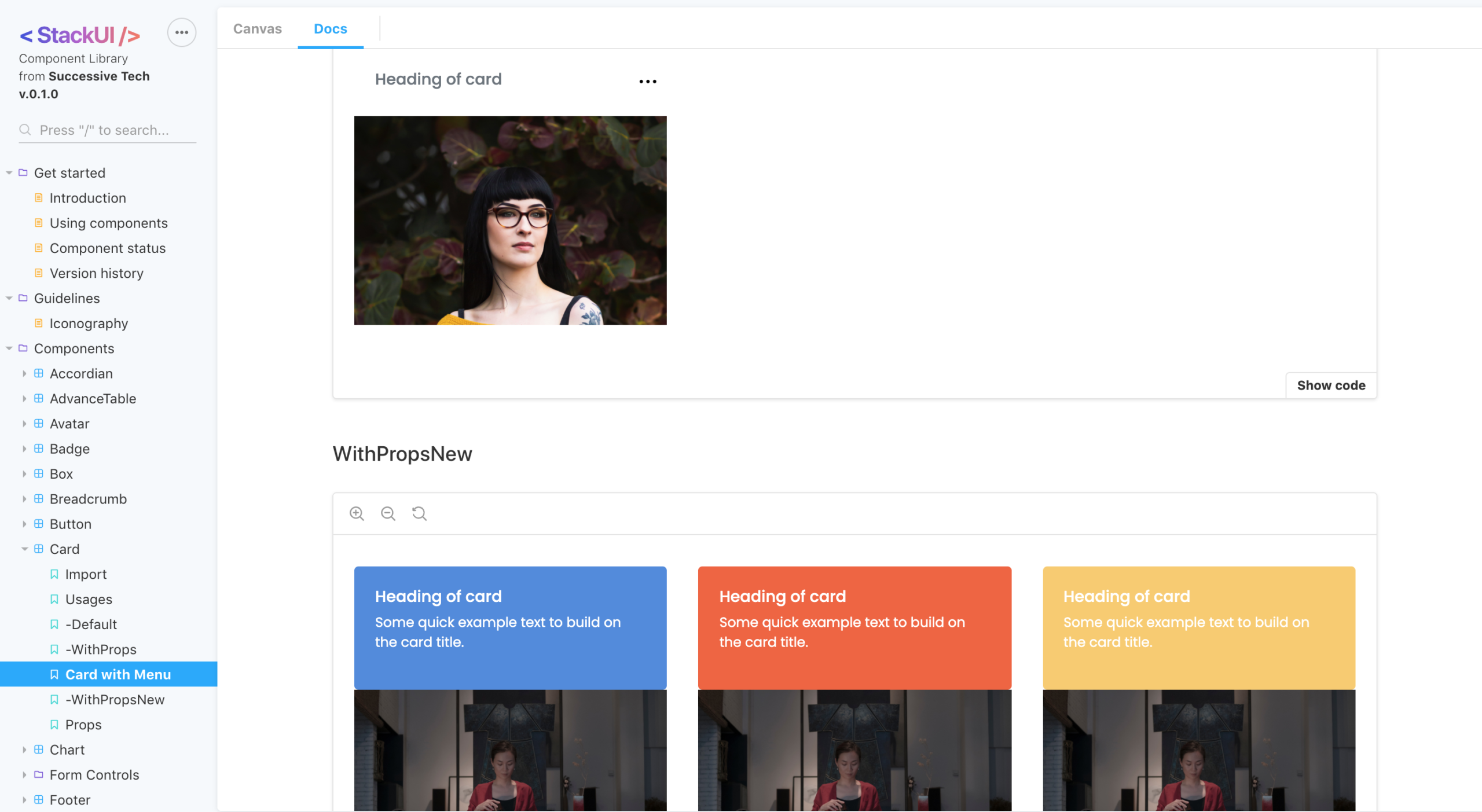
The Card component in Stack UI
We designed these components to solve specific UI problems and cover a broad range of use cases. Whether you need to show progress through a progress bar, include checkboxes or radio boxes, or add a search box in your UI, Stack UI components are available to help you. Some other useful components include the menu, accordion, chart, notification, file upload, header and footer, among many more.
All these components work seamlessly together and are flexible enough to meet a variety of requirements. Whatever the use case, Stack UI components can help you deliver the experience you want.
Read Top 10 Amazing Apps Built with React Native
And the best part is that because they cover so many different use cases and work well together, you can assemble components to create entire modules from scratch. For instance, for forms, we don’t just provide the input field, but we also provide the whole form with proper validation and all the fields (such as textarea, input, checkbox, radio and so on). This means that developers don’t need to have professional experience with CSS/HTML in order to use Stack UI. Even developers without any knowledge of UX or CSS can easily use components to create beautiful, responsive UIs by simply replacing fields as per their requirement.
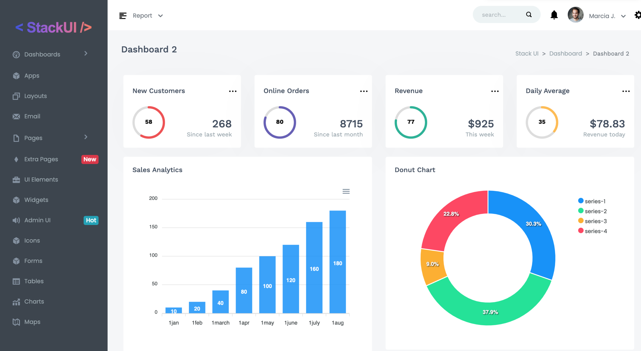
Stack UI dashboard helps you create beautiful visualizations for your data
Finally, Stack UI dashboard is a design system that uses features like calculated metrics and data connectors to help you create beautiful data visualizations. You can easily create custom dashboards and embed these in your UI. The dashboard is responsive and doesn’t cause loss of data at any resolution. It also supports several customizable themes, so you can create a dashboard specific to your application.
Read Advantages of Developing Modern Apps with ReactJS
Why should you use Stack UI?
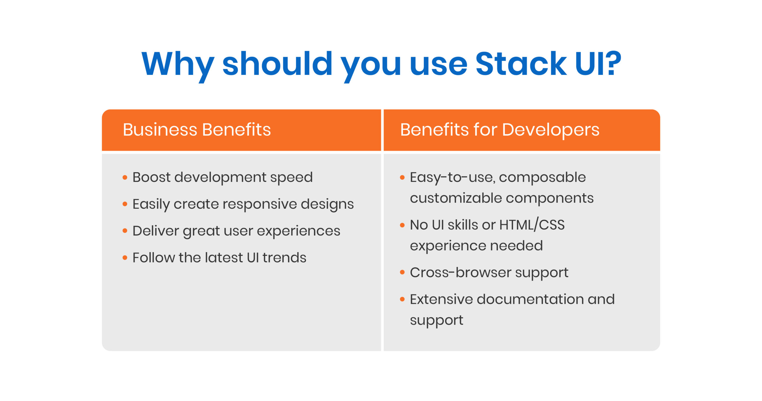 Stack UI empowers developers to create cohesive experiences for users through a shared language.
We’ve designed the UI kit with developers in mind, making it easier for them to get up and running quickly, enabling faster and easier web development. We’ve also provided thorough documentation with guidelines and conventions specific to each component.
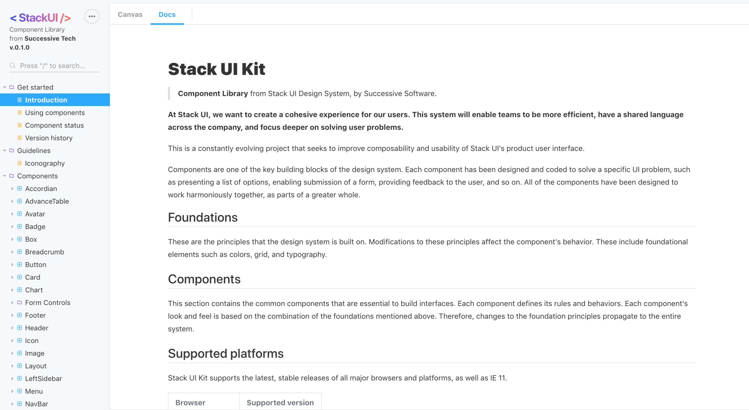
Documentation is available for each component of the Stack UI library
Stack UI supports all major browsers and platforms, including Chrome, Firefox, Safari, Edge and Internet Explorer. Also, with Stack UI, props can be customized within Storybook. We’ve implemented a feature that allows developers (or users) to quickly see changes in Storybook docs (like the inspect element feature in most browsers). Other key features of Storybook include the ability to make real-time changes, a responsive showcase with a grid system, and dark and light modes.
We’ve optimized the performance of Stack UI components so that they work quickly and smoothly in your application, no matter the size of your data set. Our components are also responsive and designed to meet accessibility standards.
Read Getting Started with Testing React Components
Start creating value for users with Stack UI today
By allowing teams to become more efficient, Stack UI helps them focus their efforts on solving user problems and delivering more value to users.
What’s more, we’re constantly improving the composability and usability of Stack UI. While all basic components have been implemented, improvements are being rolled out weekly, and our team is adding new components to the kit.
In addition to extensive resources in the form of demo videos, blogs, and documentation, you can also get support from our engineering team as you build your applications with Stack UI. Our team of experts is available to support you across channels such as public forums and live chat.
Stack UI is available for download via NPM today. We’d love to get your feedback and hear about your first impressions and experiences as you start to use it in your UI projects.